MINNEAPOLIS (AP) — A state commission selected a basic design concept Friday for a new state flag for Minnesota to replace a current banner that is considered offensive to Native Americans, but will need more time to add the finishing touches.
The final choice came down to two templates. The panel went with one bearing a stylized dark blue shape of Minnesota on the left with an eight-pointed white North Star on it, then either horizontal stripes or a solid field on the right.
The commission then decided to consider variants on that theme when it reconvenes Tuesday, including an asymmetrical Minnesota that looks more like the state’s actual shape, and either a solid light blue field on the right, or adding a green stripe along the bottom to symbolize the state’s agricultural heritage.
“Let’s marinate these for a couple of days. I think it’s important,” said the chair of the commission, Luis Fitch. “And then let’s hear what the public and the people of the state of Minnesota have to say.”
The second-place finisher featured a pair of curving “swooshes” — one white and one light blue — symbolizing the confluence of the Minnesota and Mississippi rivers, against a dark blue background with a North Star in the upper left corner. To some people, the swishes also looked like loons, the official state bird. But the panel’s members opted for the design with straight, simple lines.
None of the designs that made it to the final round generated a surge of public enthusiasm beforehand. Fitch acknowledged that as he urged his colleagues to think about what design might be accepted by future generations.
“We’re not going to be able to make everybody happy,” Fitch said. “The whole idea since Day One for me was to make sure that we can do a flag that unites us, not separates us.”
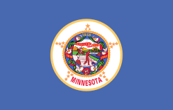
Minnesota’s current flag includes the state seal against a blue background. The seal depicts a Native American riding off into the sunset while a white settler plows his field with his rifle leaning on a nearby stump. The imagery suggests to many that the Indigenous people were defeated and going away, while whites won and were staying.
Not only do the state’s Dakota and Ojibwe tribes consider that offensive, but experts in the scientific and scholarly study of flags — known as vexillology — say it’s an overly complicated design.
Guidelines from the North American Vexillological Association say flags should be simple but meaningful, with just a few colors, easily recognizable from a distance, and without seals or lettering. Ideally, a child should be able to draw it. The group ranks Minnesota in 67th place out of 72 U.S. and Canadian state and provincial flags. Minnesota’s design dates from 1957, an evolution from the 1893 original.
The commission — which includes members of the state’s tribal and other communities of color — was tasked with producing new designs for the flag and seal by Jan 1. Unless the Legislature rejects them, the new emblems automatically become official April 1, 2024, which Minnesota observes as Statehood Day.
The commission settled earlier in the week on a new seal featuring a loon and the Dakota name for Minnesota: Mni Sóta Makoce, which can be translated as “where the water meets the sky.”
Minnesota is joining several other states in redesigning outdated flags. The Utah Legislature last winter approved a simplified flag design that still includes a beehive, a symbol of the prosperity and the industriousness of the Mormon pioneers who settled the state. Mississippi voters in 2020 chose a new state flag with a magnolia and the phrase “In God We Trust” to replace a Confederate-themed flag that had been used by Ku Klux Klan groups and was widely condemned as racist.
Other states considering simplifying their flags include Maine, where voters will decide next year whether to replace their current banner with a retro version featuring a simple pine tree and blue North Star, as well as Michigan and Illinois.


